


There are three major branches of machine learning (ML): supervised, unsupervised, and reinforcement. Supervised learning makes up the bulk of the models businesses use, and reinforcement learning is behind front-page-news-AI such as AlphaGo . We believe unsupervised learning is the unsung hero of the three, and in this article, we break down four key ways you can use this powerful technique.
What is Unsupervised Machine Learning?
Unsupervised machine learning is machine learning on unlabeled data. We have ground truth labels in supervised problems to tell us if a model’s prediction is correct. In unsupervised learning, the goal is not to make “correct” predictions but rather to expose the underlying structure of the data. Since the vast majority of the world’s data is unlabeled, this is a powerful technique with many applications.
What Can Unsupervised Machine Learning Do?
There are four key areas where unsupervised learning is currently applied.
Clustering
As the name suggests, this technique sorts your data into groups (or clusters). Data points in one cluster share similar characteristics while being dissimilar to the other clusters. For example, if we collected blood sample data, we may cluster it into sex (‘male’ and ‘female’) or blood group (‘A’, ‘B’, ‘AB’, ‘O’). Standard clustering algorithms include KMeans and Spectral Clustering.
Dimensionality Reduction
In supervised tasks, it’s common to have a large number of weak features that your model struggles to turn into predictions. You compress many (noisy) components into a smaller collection of powerful ones using dimensionality reduction. This method separates the signal from the noise and results in compact, powerful features your models can make better use of. Looking at any top Kaggle submission, you will likely see dimensionality reduction used somewhere in the preprocessing pipeline – it’s powerful. Standard dimensionality reduction algorithms include PCA and UMAP.
Association Rule Mining
Commonly used by retailers, this technique finds items/products that regularly appear together, i.e., it creates rules about how to associate products with one another. With these rules, the algorithm recommends similar products for purchase. Amazon uses this unsupervised learning technique to show you the ‘Frequently bought together and ‘Products related to this item’ sections. Standard association rule mining algorithms include Apriori and Eclat.
Automatic Anomaly Detection
Often data contains outliers or unusual results, and it would be great to flag them immediately. Automatic anomaly detection methods learn the general structure of your data and mark any data point that falls outside these bounds as anomalies. Now you are free to handle the outlier as you see fit and not waste time manually writing such algorithms yourself. Standard anomaly detection algorithms include Isolation Forest and Local Outlier Factor.
Examples
We’ve given you an overview of each major use case; now, let’s dive into some worked examples with code.
Clustering – KMeans
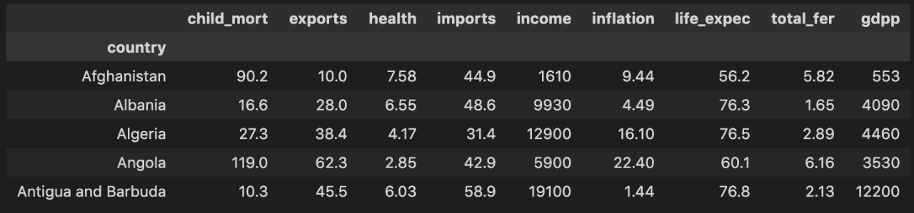
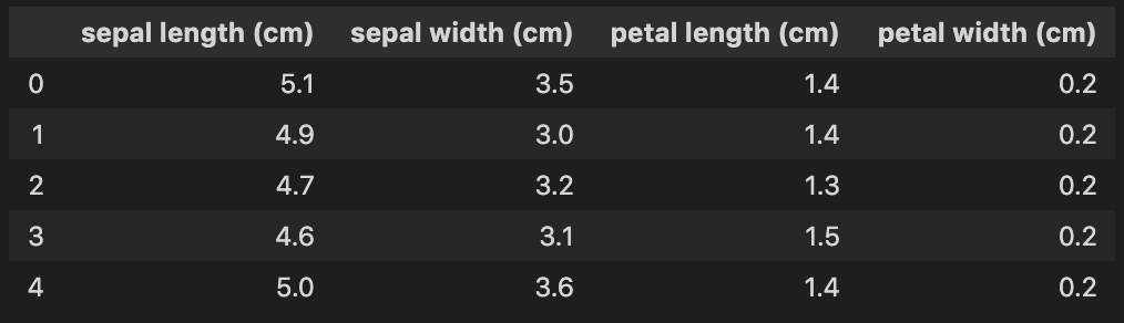
We will use KMeans on a country dataset to create clusters of various sizes. The dataset has 167 rows and 10 columns. Each row is a country, and each column is a numerical statistic about it, such as:
child_mort– Child mortality rate – the number of children younger than five who die out of every 1000 birthshealth– Total health spending per capita as a percentage of GDP per capitagdpp– GDP per capita – the total GDP divided by the population
Let’s load the data and look at the first few rows.
# Standard imports
import pandas as pd
import numpy as np
import matplotlib.pyplot as plt
import seaborn as sns
# Look at the first few rows
countries = pd.read_csv('Country-data.csv', index_col=0)
countries.head()
Let’s explore the relationship between GDP per capita (gdpp) and life expectancy (life_expec).
sns.set()
sns.scatterplot(data=countries, y='life_expec', x='gdpp')
plt.show()
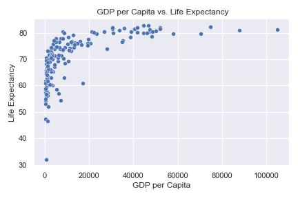
There seems to be a positive correlation between GDP per capita and life expectancy, i.e., as GDP increases, so does the number of years each individual is expected to live. However, after $20,000, all countries hover around the 80 expected year mark.
Let’s perform KMeans on this data with different sizes of K to see what underlying structures it exposes.
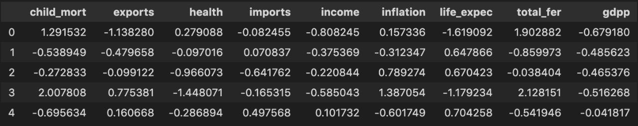
KMeans is sensitive to scales as it uses the distance between samples to decide which cluster to place them in. Thus, first, we must scale the data. We use StandardScaler to give each column mean 0 and variance 1.
from sklearn.preprocessing import StandardScaler
scaler = StandardScaler()
scaled = scaler.fit_transform(countries)
countries_scaled = pd.DataFrame(scaled, columns=countries.columns)
countries_scaled.head()
With KMeans, you must manually set the cluster size, and it will find that many regardless of the actual data structure. Other algorithms find the number of clusters themselves, and we will discuss them in future articles. We’ll choose 2, 3, 4, and 7.
Let’s create the clusters and add the cluster labels (i.e., predictions) as columns to the countries dataframe.
from sklearn.cluster import KMeans
clusters = [2, 3, 4, 7]
for cluster in clusters:
kmeans = KMeans(n_clusters=cluster, random_state=111)
# Fit on scaled data - KMeans is sensitive to scale
kmeans.fit(countries_scaled)
# Get predicted clusters
cluster_labels = kmeans.labels_
# Add as column to countries df for further analysis
countries[f'{cluster}_clusters'] = cluster_labels
We plot gdpp vs. life_expec and color each point based on its cluster.
fig, axes = plt.subplots(nrows=2, ncols=2, figsize=(10, 7))
clusters = [2, 3, 4, 7]
for i, cluster in enumerate(clusters):
ax = np.ravel(axes)[i]
sns.scatterplot(data=countries, x='gdpp', y='life_expec',
hue=f'{cluster}_clusters', palette='viridis', ax=ax)
ax.set(title=f'{cluster} Clusters')
fig.suptitle('GDP per Capita vs. Life Expectancy', fontsize=13)
plt.tight_layout()
plt.show()
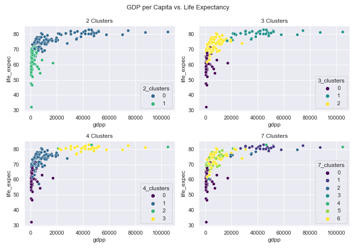
- 2 Clusters – the world is split into the haves and have-nots. Cluster 0 contains countries with a life expectancy above 70, and cluster 1 has those below 70.
- 3 Clusters – this world is split into under-developed (cluster 0), developing (cluster 2), and developed (cluster 1). Note that cluster labels don’t correspond to a numerical ordering – the most developed countries are cluster 1. This is a helpful grouping and valuable information for any supervised models or further analysis.
- 4 Clusters – more clusters are not always better. Clusters 0, 1, and 3 seem to represent the same under-developed, developing, and developed split we saw above, and it’s not entirely clear what cluster 2 represents.
- 7 Clusters – too many clusters. It’s hard to keep track of so many colors on one plot, and what each set symbolizes is unclear. It looks like clusters 0 and 1 represent the least and most developed countries, respectively. We leave it as an exercise to the reader to perform further analysis.
Note that your results may vary since KMeans has randomness baked into it. However, if you set random_state=111 in KMeans(), you should get identical results to the above.
Dimensionality Reduction – PCA
We will simplify the problem posed by the classic iris dataset significantly. It contains 150 rows and 4 columns. Each row is an iris flower, and each column is a measurement such as sepal width and sepal length. The target is one of three different iris species labeled 0, 1, or 2.
from sklearn.datasets import load_iris
iris = load_iris()
X = pd.DataFrame(data=iris.data, columns=iris.feature_names)
y = iris.target
print(X.shape) # (150, 4)
X.head()
Let’s look at a plot of sepal length against sepal width while coloring each sample based on its label.
sns.scatterplot(data=X,
x='sepal length (cm)',
y='sepal width (cm)',
hue=y,
palette='Dark2')
plt.show()
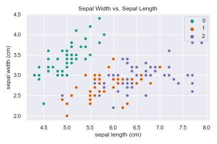
Here we could create a linear classifier to divide class 0 from classes 1 and 2. But it is not possible to linearly separate the latter two classes. Let’s see how the story changes when applying Principal Component Analysis (PCA).
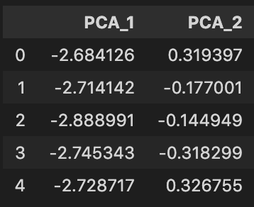
from sklearn.decomposition import PCA
# Create reduced dataframe with just 2 PCA features
pca = PCA(n_components=2)
X_reduced = pca.fit_transform(X)
X_reduced = pd.DataFrame(data=X_reduced, columns=['PCA_1', 'PCA_2'])
print(X_reduced.shape) # (150, 2)
X_reduced.head()
Using PCA, we reduced the number of features/columns in the dataset from 2 to 4 – 50% reduction! Let’s look at a plot of the PCA features against each other while coloring each sample based on its label.
sns.scatterplot(data=X_reduced, x='PCA_1', y='PCA_2', hue=y,
palette='Dark2')
plt.show()
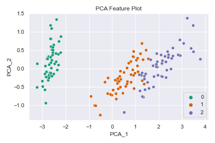
What a difference! Class 0 remains linearly separable from the others, and now classes 1 and 2 are linearly separable from each other (almost)! Using dimensionality reduction, you can build a higher-performing model with fewer features. Such is the power of unsupervised learning.
Unsupervised Learning with H2O
If you want to use unsupervised learning with H2O, have a look at either our open source H2O-3 package or Driverless AI . Both tools support several algorithms such as KMeans (clustering), PCA (dimensionality reduction), and Isolation Forest (anomaly detection), to name a few.
Conclusion
There we have it, a whirlwind tour of unsupervised learning. We’ve seen how we can apply this technique to four major areas: clustering, dimensionality reduction, anomaly detection, and association rule mining. We’ve also seen code examples for the first two (more common) use cases. Also, check out our previous blog post about anomaly detection with Isolation Forest.
Unsupervised learning is a powerful tool in your machine learning toolbox that can be valuable on its own or in combination with other supervised problems. We’ve supervised you as you learned the basics, but now it’s time to get out there and to implement these unsupervised algorithms without our supervision  Good luck!
If you want to build top-performing unsupervised models without the complexities of coding, check out H2O’s AI Hybrid Cloud – request a demo today.