


H2O+R+Tableau Demo
A small demonstration on how H2O and Tableau interact through R to bring beauty to big data. Don’t just consume, contribute your code and join the movement: https://github.com/h2oai
User conference slides on open source machine learning software from H2O.ai at: http://www.slideshare.net/0xdata
Talking Points:
Read the Full Transcript
Presenter:
This video is a demonstration of how it is possible and very useful to connect Tableau to R and subsequently to H2O in order to utilize the best features from each platform.
Connecting H2O, R, and Tableau
H2O from OX Zeta is a fast in-memory machine learning platform that can ingest data sets from HDFS or from your local drive and create scalable models that can be accessed through H2O's arrest API from within R. R in this case will act as a catalyst between Tableau and H2O, as it already has open source packages available from OX Zeta and from the CRAN that will allow R to talk to H2O as well as Tableau. And hence connecting to two platforms. Tableau will then connect to our via a local socket server. And lastly, Tableau is great for taking snapshots of data and visualizing scalable predictive models into dynamic worksheets and reports and making information actionable.
Setting Up a Local Socket Server For Tableau
The first step is to create the connection from within R to Tableau. So you load up the Library R Serve, then run the command run R Serve. Now you have a local socket server set up for Tableau.
I've loaded up a Tableau Airline demo workbook and the first thing you do is check for the R connection that we've set up and now it is connected to R. So first I will run the script to start H2O in R. If you go to R Studio, you'll see that the command has ran and will give you back all the information about the cluster that you've started. Next, I will upload the airline_allyears2K_headers file onto H2O.
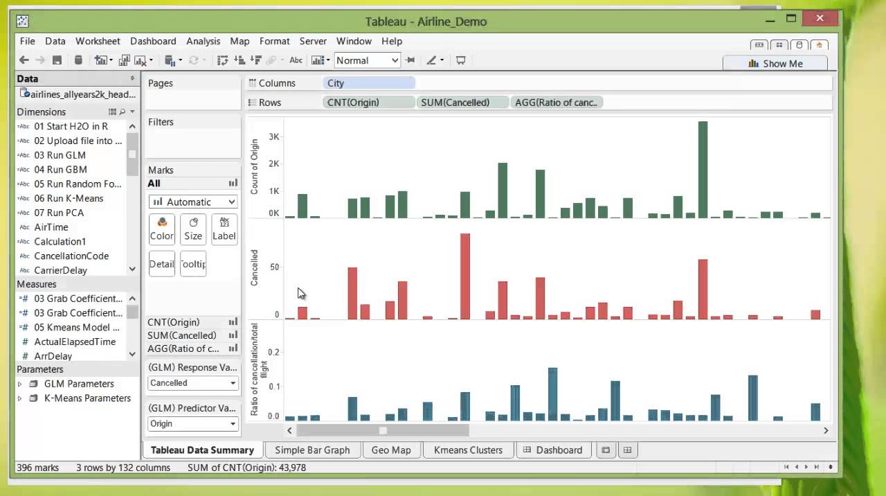
Tableau Data Summary
And you can see from the progress bar here that it finished loading. So the first thing we see is a Tableau data summary page that you create, so the first bar chart you see is the count of the number of flights total in the dataset from each point of origin. And the second bar chart you see is the number of cancellation depending on the departure points. And lastly, if you create a ratio of the number of cancellations per total flight for each departure point, you'll see certain areas tend to have higher ratios of cancellations, Arlington, Boston, for example.
Running GLM
If we go to the next worksheet that I've created with all the parameters available for modeling on the site here, we can input our response variable, which is cancellation, and our predictor variable, which is the origin of departure. We can adjust things like alpha or the cross-validation and value from within Tableau. And then we simply run Run GLM. And you'll see again in R studio that the process ran.
Now that you ran GLM, grab the coefficients from GLM, and now you have a bar chart of how likely a flight is canceled based on the departure points. So again, you see places like Boston pop up and just as easily we can change the particular variable from something like origin to destination, in which case we'll put in destination, rerun GLM, and once again grab the coefficient and now you have the likelihood of a flight being canceled based on its destination point.
And next, we'll see the same data visualized differently and perhaps more usefully. So if there are flights coming into Utica, it would seem that it is more likely for the flight to be canceled. Conversely, if there are flights coming into Atlantic City, it seems like it won't be as likely to get canceled. We can do things like going back and changing that same value from destination to origin, running the GLM again and grabbing those same coefficients. Flights from Boston is far more likely to get canceled than any other city in the United States that we have shown.
K-Means Model
Next, we can do the same for K-Means. So again, we have the parameters on the side where you have the K-Means model, name and the number of centers it will have, as well as the columns you can use to calculate the clusters. And we have selected here all available columns. So all real number columns will be put into the calculation. So we're just gonna run K-Means. And then grab the K-Means model, cancellation fives, or arrival delays. And we can always add more measures and dimensions into the cluster chart. Here you see cancellation, which has either the value of zero or one for having canceled or not canceled is split into two clusters.
Summary
So in summary, we got a chance to load the data into Tableau, look at the general information without any predictive analytics, then move on to actually doing models really quickly, running multiple GLMs and K-Means models and bringing the information back into Tableau, visualizing them in a way that is very easy to read. And we don't have to write a script each time we want to run these functions. In fact, you could just simply save this as a template and edit the data connection.