


That which is measured improves – Karl Pearson , Mathematician.
Almost everyone has heard of accuracy, precision, and recall – the most common metrics for supervised learning . But not as many people know the metrics for unsupervised learning . So, in this article, we will take you through the most common methods and how to implement them.
But first, a warning. There are many ways we could introduce you to these metrics. If you just want to read a quick summary, a list of pros and cons, and dive into the mathematical definition, have a look at scikit-learn’s clustering performance evaluation page.
For a more practical approach, grounded in how you would actually use these metrics, read on.
The Two Types of Metrics – With or Without Labels
Unsupervised metrics fall into two categories: those that require ground truth labels and those that don’t. We’ll call them label and non-label metrics, respectively, throughout.
Label metrics are similar to those found in supervised learning; higher scores generally correspond to better-performing models. Non-label metrics explain the structure of the model and the cluster shapes.
Unsurprisingly, label metrics give a much clearer picture of how useful your model is. But, since we are doing unsupervised learning, by definition, we will rarely have these labels at hand! If we did, we would use that information without needing to do clustering, or we’d do supervised learning instead. However, we must work with the tools we’ve been given.
Dense, Well-Separated, and Convex Clusters
Not all clusters are created equal. Some are much easier for algorithms to find than others. To illustrate this concept, we’ll make some plots.
# Standard imports
import pandas as pd
import numpy as np
import matplotlib.pyplot as plt
import seaborn as sns
from sklearn.datasets
import make_blobs
# Nicer plots than standard matplotlib
sns.set()
# Set random seed
N_SAMPLES = 1500
SEED = 170
# Finally, generate synthetic data and plot the clusters.
std = 1
X, y = make_blobs(N_SAMPLES, cluster_std=std, random_state=SEED)
sns.scatterplot(x=X[:, 0], y=X[:, 1], hue=y, palette='bright')
plt.axis('off') plt.show()
Three Synthetic Clusters

The clusters above are every clustering algorithm’s dream. They are dense (the points are tightly packed together), well-separated (there is blank space between all clusters), and convex (you can approximate each shape with a circle). Note that convex clusters can exist in any dimension; if you project one onto 2D it’s a circle, and onto 3D, it’s a sphere. Some algorithms, such as KMeans, can only find convex clusters, and all non-label metrics in scikit-learn give higher scores to convex clustering.
Now let’s look at some shapes that do not satisfy these conditions.
# Try a range of standard deviations
stds = [1, 3, 10]
fig, axes = plt.subplots(nrows=1, ncols=3, figsize=plt.figaspect(1/3))
for ax, std in zip(axes, stds):
X, y = make_blobs(N_SAMPLES, cluster_std=std, random_state=SEED)
sns.scatterplot(x=X[:, 0], y=X[:, 1], hue=y, palette='bright', ax=ax)
plt.show()
Synthetic Clusters Generated with Different Standard Deviations

As the standard deviation increases, cluster density decreases (the points are not so tightly packed together), and they become less separated (more and more of the points overlap). These clusters are still convex, however since they are circular. We’ll look at non-convex plots later.
Dense, well-separated, and convex clusters (like those with std=1) result in the best scores for all unsupervised metrics. Unsurprisingly, it is not common to find such shapes in the wild. Therefore, we devote the rest of this article to analyzing non-convex clusters.
Unsupervised Machine Learning Metrics Example
Let’s create a toy dataset to work with by adapting the code from scikit-learn’s excellent cluster algorithm comparison post.
# Create anisotropically distributed clusters
X, y_aniso = make_blobs(n_samples=N_SAMPLES, random_state=SEED)
transformation = [[0.6, -0.6], [-0.4, 0.8]]
X_aniso = np.dot(X, transformation)
# Plot sns.scatterplot(x=X_aniso[:, 0], y=X_aniso[:, 1], hue=y_aniso, palette='bright')
plt.show()
Anisotropically Distributed Clusters

These clusters are dense and well-separated but not convex. Let’s fit three standard unsupervised algorithms on this data and plot the results. We choose a partitioning algorithm (KMeans) that always creates convex clusters, a hierarchical algorithm (AgglomerativeClustering), and a density-based algorithm (SpectralClustering).
Partitioning algorithms like KMeans assume that the clusters will be a specific shape (convex) and apply this assumption to any data they find. Hierarchical algorithms split the space into dendrograms and find different shapes depending on the linkage criteria (we choose the default ward). Density-based algorithms view clusters as spaces of high point density (lots of points close together) separated by spaces of low point density (no or few points). Thus they can find clusters of any shape; the algorithm continues placing points in a cluster as long as there is high density and stops once it reaches an area of low density.
Let’s write a function to fit and plot the algorithms’ predictions.
def fit_and_plot_clusters(X, y, n_clusters=3, seed=111):
# Normalize for better results
X = StandardScaler().fit_transform(X)
# Initialize algorithms kmeans = KMeans(n_clusters=n_clusters, random_state=seed)
agglom = AgglomerativeClustering(n_clusters=n_clusters, linkage='ward')
spectral = SpectralClustering(
n_clusters=n_clusters,
random_state=seed,
affinity='nearest_neighbors',
)
# Fit
kmeans.fit(X)
agglom.fit(X)
spectral.fit(X)
# Store predictions
y_preds = {}
y_preds['Ground Truth'] = y
y_preds['KMeans'] = kmeans.labels_
y_preds['Agglomerative Clustering'] = agglom.labels_
y_preds['Spectral Clustering'] = spectral.labels_
# Plot predictions vs. ground truth
fig, axes = plt.subplots(nrows=1, ncols=4, figsize=(10, 3))
for i, name in enumerate(y_preds.keys()):
ax = axes[i]
sns.scatterplot(x=X[:, 0], y=X[:, 1], hue=y_preds[name], ax=ax, legend=True, palette='bright')
ax.set(title=name) ax.axis('off')
ax.legend(loc='upper right')
plt.tight_layout()
plt.show()
# Store y_preds for use with metrics
return y_preds
Running it returns,
y_preds_dict = fit_and_plot_clusters(X_aniso, y_aniso, seed=SEED)
Comparing Different Clustering Algorithms
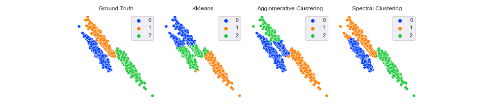
Quite a range of results. First, note that the ground truth label for the bottom right cluster is 2. Both KMeans and AgglomerativeClustering labeled it 1, whereas SpectralClustering gave it 2. Does this mean spectral is correct and the others are not? Thankfully, no.
With all clustering metrics, you can permute the names of the clusters without impacting the score. For example, changing the labels from [0, 1, 2] to ['a', 'b', 'c'] or [10, 13, 444] wouldn’t change the results.
Looking now at the clusters themselves, it seems like KMeans and AgglomerativeClustering were about equally effective (or ineffective, depending on your point of view), and SpectralClustering classified almost all points correctly. Will that be reflected in our scores?
Unsupervised Metrics With Labels
The most common metric used if the ground truth labels are available is Rand Index . It measures the similarity of the predictions to the labels. In more mathematical terms, it’s proportional to the number of label-prediction pairs that match. Thus, the score is bounded in the range [0, 1], with 0 being the worst and 1 the best.
Before we calculate the scores, let’s create a helper print function.
def print_score_with_labels(y_true, y_preds_dict, score_func):
for algo_name, preds in y_preds_dict.items():
score = score_func(y_true, preds)
print(f'{algo_name:<25}: {score:.3f}')
Now we print the rand index scores.
from sklearn.metrics import rand_score
print('Rand Index')
print_score_with_labels(y_aniso, y_preds_dict, rand_score)
Rand Index
Ground Truth : 1.000
KMeans : 0.827
Agglomerative Clustering : 0.857
Spectral Clustering : 0.982
As expected, the ground truth labels give a maximum score of 1. SpectralClustering is the best algorithm with 0.982, which makes sense since only a few points are incorrectly classified. KMeans is the worst performer with 0.827, and AgglomerativeClustering is slightly better with 0.857. These numbers seem to make intuitive sense, and the ordering corresponds to what we can see visually.
However, do you think values above 0.8 seem pretty high for the two worst performers? Looking at the plot, it doesn’t seem like they classified 80%+ points correctly; they only got one cluster completely correct and the other two were half right.
Did KMeans and AgglomerativeClustering learn the structure of our data? Or was it just luck? The adjusted_rand_score will help us to answer that question. It is the same as the Rand Index but adjusted for chance. The score is 1 for perfect clustering and close to 0 for random labeling.
from sklearn.metrics import adjusted_rand_score
print('Adjusted Rand Index')
print_score_with_labels(y_aniso, y_preds_dict, adjusted_rand_score)
Adjusted Rand Index
Ground Truth : 1.000
KMeans : 0.609
Agglomerative Clustering : 0.685
Spectral Clustering : 0.959
The adjusted rand score gives us the same ordering but different scores. The SpectralClustering score has stayed about the same, but both KMeans and AgglomerativeClustering have dropped significantly. This result implies that spectral has learned the shape of the clusters, but the other two, while being somewhat helpful, have a sizable chunk of their predictions down to random chance. One reason for this is that KMeans assumes the data contains convex clusters, but the data is non-convex. Thus, many correct predictions are just down to luck rather than the algorithm learning the underlying data structure.
Both rand_score and adjusted_rand_score give spectral clustering the highest score, which aligns with our expectations. If you have the ground truth labels available, these scores are helpful.
Unsupervised Metrics Without Labels
Let’s move on to looking at some scores you can use when you do not have ground truth labels available (as in most real-life situations).
First, let’s create a helper print function.
def print_score_without_labels(X, y_preds_dict, score_func):
for algo_name, preds in y_preds_dict.items():
score = score_func(X, preds)
print(f'{algo_name:<25}: {score:.3f}')
We pass X rather than y_true since we don’t have labels available. We will also print the score for the ground truth labels for educational purposes.
The first score we’ll look at is the silhouette_score. This score measures how well-defined the clusters are. It is defined for each point and made of two parts:
- The mean distance between a point and all other points in the same cluster.
- The mean distance between a point and all other points in the next nearest cluster.
It is bound between -1 (incorrect clustering) and +1 (very dense, well-separated, and convex clustering). Scores close to 0 indicate that clusters overlap. Note that, in general, it gives higher scores to convex clusters, and this can be misleading if your data is non-convex (as we shall soon see).
If you want to calculate the Silhouette score for each point, use silhouette_samples. The silhouette_score function returns the mean silhouette score across all samples. We will stick to just silhouette_score.
from sklearn.metrics import silhouette_score
print('Silhouette Score')
print_score_without_labels(X_aniso, y_preds_dict, silhouette_score)
Silhouette Score
Ground Truth : 0.480
KMeans : 0.508
Agglomerative Clustering : 0.480
Spectral Clustering : 0.485
Another interesting result! The ground truth labels have a lower score (0.48) than both KMeans (0.508) and SpectralClustering (0.485)! Indeed, KMeans has the highest score despite the fact we know it classified the fewest points correctly. This is because the silhouette score is generally higher for convex clusters regardless of the data shape and KMeans always produces convex clusters. SpectralClustering has captured the underlying non-convex structure of the data, but the silhouette score cannot express this. Therefore, when working with non-convex data, this score is not very helpful.
Let’s move on to the Calinski-Harabasz score (the ‘sz’ is pronounced ‘shh’), also called the Variance Ratio Criterion. It is the ratio between the within-cluster dispersion and the between-cluster dispersion, i.e., how spread out the points are in the clusters vs. how spread out the clusters are.
This score is unbounded and fast to compute. Higher scores imply that the clusters are dense and well-separated. As with the Silhouette score, the Calinski-Harabasz score is generally higher for convex clusters.
from sklearn.metrics import calinski_harabasz_score
print('Calinski Harabasz Score')
print_score_without_labels(X_aniso, y_preds_dict, calinski_harabasz_score)
Calinski Harabasz Score
Ground Truth : 2904.204
KMeans : 3781.541
Agglomerative Clustering : 3211.611
Spectral Clustering : 3032.493
Again we see the futility of applying non-label scores to non-convex clusters. The Calinski-Harabasz score gives the ground truth labels the lowest score (2904) and KMeans the highest (3781). Note that SpectralClustering has the score closest to the ground truth labels. If we had the labels available, we could say that the algorithm with the score closest to them was the best. However, as we’ve already said, this is unlikely to happen in reality. One way to combat this is to plot your clusters in 2D or 3D via dimensionality reduction and inspect if they are convex or not.
Conclusion
Analyzing the performance of clustering algorithms can be tricky. Without labels to guide you, it can feel like walking through a jungle without a map.
We introduced you to four of the most common metrics, but there are more to test in scikit-learn. We encourage you to try a range of scores to get a well-rounded picture of model performance. However, don’t forget that metrics are only part of the puzzle. You may get conflicting scores, but the surest way to know which algorithm performed better is to test them in real life. The models that discover the best information will deliver more value to your business. This value translates into more growth and more problems solved. And they are metrics worth measuring.
If you want to implement state-of-the-art clustering methods across your organization, start your demo of H2O AI Cloud today.