
Creating a Binary Classifier to Sort Trump vs. Clinton Tweets Using NLP

The problem : Can we determine if a tweet came from the Donald Trump Twitter account (@realDonaldTrump) or the Hillary Clinton Twitter account (@HillaryClinton) using text analysis and Natural Language Processing (NLP) alone?
The Solution : Yes! We’ll divide this tutorial into three parts, the first on how to gather the necessary data, the second on data exploration, munging, & feature engineering , and the third on building our model itself. You can find all of our code on GitHub (https://git.io/vPwxr).
Part One: Collecting the Data
Note: We are going to be using Python. For the R version of this process, the concepts translate, and we have some code on Github that might be helpful. You can find the notebook for this part as “TweetGetter.ipynb” in our GitHub repository: https://git.io/vPwxr.
We used the Twitter API to collect tweets by both presidential candidates, which would become our dataset. Twitter only lets you access the latest ~3000 or so tweets from a particular handle, even though they keep all the Tweets in their own databases.
The first step is to create an app on Twitter, which you can do by visiting https://apps.twitter.com/. After completing the form you can access your app, and your keys and tokens. Specifically we’re looking for four things: the client key and secret (called consumer key and consumer secret) and the resource owner key and secret (called access token and access token secret).

We save this information in JSON format in a separate file
Part Two: Data Cleaning and Munging
You can find the notebook for this part as “NLPAnalysis.ipynb” in our GitHub repository: https://git.io/vPwxr.
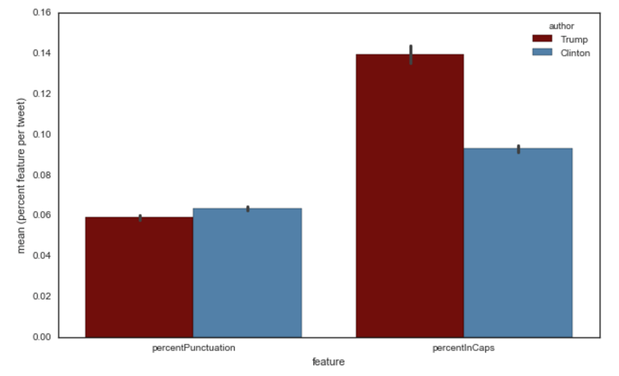
To fully take advantage of machine learning, we need to add features to this dataset. For example, we might want to take into account the punctuation that each Twitter account uses, thinking that it might be important in helping us discriminate between Trump and Clinton. If we take the amount of punctuation symbols in each Tweet, and take the average across all Tweets, we get the following graph:
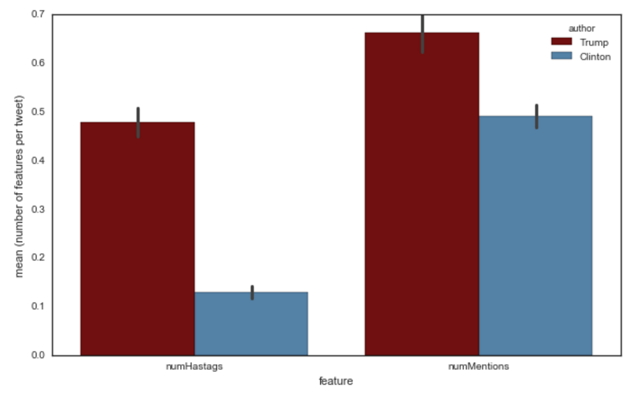
Or perhaps we care about how many hashtags or mentions each account uses:
With our timestamp data, we can examine Tweets by their Retweet count, over time:

The tall blue skyscraper was Clinton’s “Delete Your Account” Tweet


The Democratic National Convention was in session from July 25th to the 28th

Heatmap of Trump Tweets, by day and hour
sentiment analysisDavid Robinson did this
Part Three: Building, Training, and Testing the Model
You can find the notebooks for this part as “Python-TF-IDF.ipynb” and “TweetsNLP.flow” in our GitHub repository: https://git.io/vPwxr.
There were a lot of approaches to take but we decided to keep it simple for now by only using TF-IDF vectorization. The actual code writing was relatively simple thanks to the excellent Scikit-Learn package alongside NLTK.
We could have also done some further cleaning of the data, such as excluding urls from our Tweets text (right now, strings such as “zy7vpfrsdz” get their own feature column as the NLTK vectorizer treats them as words). Our not doing this won’t affect our model as the urls are unique, but it might save on space and time. Another strategy could be to stem words, treating words as their root (so ‘hearing’ and ‘heard’ would both be coded as ‘hear’).
Still, our model (created using H2O Flow) produces quite a good result without those improvements. We can use a variety of metrics to confirm this, including the Area Under the Curve (AUC). The AUC measures the True Positive Rate (tpr) versus the False Negative Rate (fpr). A score of 0.5 means that the model is equivalent to flipping a coin, and a score of 1 means that the model is 100% accurate.

The model curve is blue, while the red curve represents 50–50 guessing

Can you guess which words (variables) correspond (are important) to which candidate?